Adaptive vs Responsive Web Design: Which Is Better for Your eCommerce?
Phil Preston 13 min read
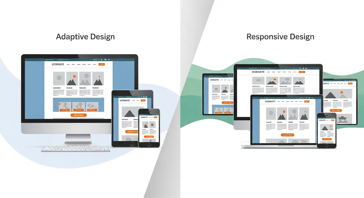
For most retail teams, the debate around adaptive vs responsive web design feels deceptively simple on the surface. One approach is widely adopted, recommended by platforms, and familiar to almost every developer. The other is less common, more complex, and often dismissed as outdated or unnecessary.
For the vast majority of commerce teams, responsive design remains the default and most practical path. Yet for medium to large eCommerce brands operating complex digital ecosystems, this decision is rarely academic.
It directly affects page speed, conversion rates, SEO performance, development velocity, and long-term cost of change. It influences how well your storefront integrates with backend systems such as ERP, PIM, CMS, inventory platforms, point-of-sale systems, and CDPs. And, critically, it shapes how effectively your business can respond to customer behaviour across devices.
This article unpacks the real trade-offs behind adaptive vs responsive design in modern eCommerce. The goal is clarity: helping CTOs, Heads of Digital, and eCommerce leaders make a decision that holds up operationally, not just conceptually.
Why This Question Still Matters
If responsive design has been the default for over a decade, why are senior commerce teams still revisiting this discussion?
Perhaps because the context has changed. Modern eCommerce sites are no longer simple storefronts. They are distributed systems sitting on top of multiple services: commerce engines, content platforms, search, pricing, promotions, analytics, experimentation tools, and enterprise back-office systems that require careful management and orchestration. At the same time, customer expectations around speed and usability, particularly on mobile, have increased dramatically.
Core Web Vitals now directly influence organic visibility. Mobile traffic often exceeds desktop traffic, but mobile conversions still lag. And every additional millisecond of latency has a measurable impact on revenue.
In this environment, design decisions that once felt purely “frontend” now have architectural consequences.
That’s why the adaptive vs responsive question has resurfaced. Not as a design trend, but as a discussion of performance and scalability.
What Responsive Web Design Really Means Today
Responsive web design is commonly described as “fluid grids and flexible layouts,” but that definition understates what actually happens in production eCommerce environments.
In practice, responsive design means:
A single URL and codebase serving all devices
One HTML document per page, styled via CSS media queries
Layout changes driven by viewport width rather than device type
The same underlying content and functionality are exposed everywhere
The browser receives the same page structure whether the user is on a desktop monitor or a smartphone. CSS and client-side logic decide how that content is arranged, resized, or hidden.
From an operational perspective, this approach offers strong advantages. There is one site to maintain, one SEO surface, one analytics implementation, and one release pipeline. Content teams publish once through a central content management system. Engineering teams debug once. QA teams validate one experience across breakpoints.
For most platforms and agencies, responsive design is the path of least resistance, and often the correct one. But responsive design also comes with implicit assumptions that don’t always hold at scale.
What Adaptive Web Design Actually Involves
Adaptive web design takes a fundamentally different approach.
Instead of delivering the same page to every device and reshaping it in the browser, adaptive design delivers different layouts or templates based on the device context. This usually involves:
Server-side or edge-level device detection
Distinct layouts for mobile, tablet, and desktop
Conditional rendering of components and assets
In some cases, different content hierarchies per device
The key distinction is intent. Adaptive design assumes that device context matters, and cannot be sufficiently handled using browser tools such as media queries.
It’s important to note that adaptive design indicators are not foolproof and can occasionally have “false positives” without careful consideration of the kinds of devices that are going to be targeted.
Generally, adaptive enables far more aggressive optimisation, but at a cost. Adaptive design introduces multiple presentation layers to maintain, test, and evolve. It increases architectural complexity and requires greater discipline across teams responsible for web development and release governance.
This is why many organisations moved away from adaptive designs in the early 2010s, when mobile sites were often bolted on as afterthoughts.
What’s changed since then is the business value of performance and the tooling available to manage complexity.
Clearing Up Common Misconceptions
Before comparing the two approaches, it’s important to separate them from adjacent concepts that are often conflated.
Responsive and adaptive design are not the same thing as:
Headless commerce
Composable commerce
Progressive Web Apps (PWAs)
Modern frontend frameworks
A headless architecture can support responsive or adaptive design. A PWA can be fully responsive or partially adaptive. A composable stack doesn’t dictate how the frontend is rendered.
These are architectural enablers, not design strategies. In fact, many of the most sophisticated adaptive implementations today exist within headless and composable environments, where teams have the freedom to tailor delivery without platform constraints.
Where the Real Differences Emerge
Performance is often the reason adaptive design re-enters the conversation. In a responsive model, the browser may download unnecessary assets for a given device, such as large images, complex layouts, or scripts intended primarily for desktop interactions.
With careful engineering, these can be mitigated. Responsive images, code splitting, lazy loading, and mobile-first CSS all help. But when the needs of the mobile site do not require all of the same functionality as desktop or tablet versions at all, then there can be significant performance gains in not including them at all.
Adaptive design changes the equation. Because the server knows the device context, it can deliver smaller, simpler pages to mobile users by design. Fewer images. Fewer components. Less JavaScript. Less layout complexity.
This directly affects:
Largest Contentful Paint (LCP)
Interaction latency
Perceived speed
Bounce rates on mobile
From a Core Web Vitals perspective, adaptive approaches can have a higher performance ceiling, particularly on low-powered devices and slower networks.
The caveat is critical: poorly implemented adaptive sites can be slower than well-built responsive ones. Adaptive design is not a shortcut.
Conversion and User Experience Trade-offs
Performance matters because it influences conversion. However, layout and interaction design matter just as much.
Responsive design encourages consistency. Users see the same product information, features, and flows regardless of device. This reduces cognitive friction and supports omnichannel journeys, reinforcing a coherent brand presence across touchpoints.
However, that consistency can also be limiting.
Mobile users behave differently. They scan more. They have less patience. They are often task-oriented rather than exploratory.
Desktop users are more likely to compare products, read long descriptions, and interact with richer UI elements.
Responsive layouts try to reconcile these behaviours in a single structure, while adaptive layouts embrace their differences.
With adaptive design, mobile experiences can be intentionally simplified: fewer distractions, clearer calls to action, shorter paths to checkout, including streamlined interactions with a payment gateway. Desktop experiences can remain information-dense without compromising usability.
This matters for:
Product detail pages with complex specifications
Large category pages with deep filtering
Multi-step checkout flows
Discovery-heavy experiences
Adaptive design allows teams to optimise for intent rather than just screen size, often improving the overall customer experience.
That flexibility can unlock conversion gains, but only if the organisation has the capability to design, test, and maintain divergent experiences responsibly, with clear goals around conversion rate optimisation.
SEO: Simplicity vs Control
From an SEO perspective, responsive design is undeniably simpler and is actively encouraged by Google and others.
One URL per page means no duplicate content concerns, no alternate annotations, no caching concerns, and a single surface for inbound links. Search engines crawl once, index once, and attribute authority cleanly.
Adaptive design can still perform well in search, but it requires a more complex solution in addition to careful planning and maintenance. Separate mobile and desktop URLs require canonical and alternate tags. Dynamic serving requires correct headers. Content parity must be maintained to avoid indexing issues.
Modern search engines are far more capable of handling these patterns than they once were, but the margin for error is higher.
Importantly, search engines increasingly reward performance and user experience signals. A faster adaptive mobile page can outperform a slower responsive one, even if the latter is technically simpler.

Development Velocity and Team Impact
This is where many adaptive ambitions fail. Responsive design scales well operationally. One codebase. One design system. One QA process. One deployment pipeline.
Adaptive design multiplies effort. Each new feature must be considered across multiple presentation layers. Each change introduces more surface area for bugs. QA becomes more complex. Documentation matters more.
For teams without strong engineering leadership and process maturity, adaptive design often becomes unsustainable.
That doesn’t mean it’s inherently flawed; it means it’s not neutral. It demands a higher standard of execution.
Many modern teams mitigate this by adopting hybrid approaches: a responsive foundation with adaptive enhancements on high-impact pages, or device-specific rendering handled at the edge rather than through duplicated templates.
The success of these approaches depends less on the design philosophy and more on the discipline of the team implementing them.
Cost of Change and Long-Term Scalability
Every commerce decision should be evaluated not just on initial build cost, but on the cost of change over time.
Responsive design typically has a lower total cost of ownership. Updates are faster. Redesigns are simpler. Content workflows are unified.
Adaptive design often increases long-term costs unless the performance and conversion gains justify the added costs.
For some businesses, they do. For others, adaptive becomes technical debt masquerading as optimisation.
The critical question is not “which approach is better?” but “what problem are we solving, and how much complexity are we willing to carry to solve it?”
Responsive Design Is Usually the Right Choice
Responsive design is generally the better option when:
Your team needs high development velocity
Content changes frequently
Backend systems already introduce complexity
Performance is acceptable with optimisation
You value operational simplicity over marginal gains
For most retailers, a well-engineered responsive site, especially within a headless or composable architecture, delivers excellent results.
If in doubt, a responsive design is going to be the best option.
When Adaptive Design Is Worth Considering
Adaptive design becomes compelling when:
Mobile traffic dominates and performance is a measurable bottleneck
Highly customised user experience including features that may only be relevant for certain device types
Better optimisation for legacy devices - the customer base may not be able to take advantage of modern web technologies
In these cases, adaptive techniques can unlock gains that are more difficult with responsive layouts. The organisations that succeed with adaptive design treat it as a strategic performance investment, not a design preference.
The Role of an Expert Engineering Partner
One consistent pattern across successful implementations is the involvement of experienced, backend-aware engineering teams.
Adaptive vs responsive design is not a UX decision alone. It touches:
API design
Caching strategy
CMS and PIM integration
Search and analytics implementation
Deployment pipelines
SEO architecture
This is where many agencies fall short: focusing on layout without understanding system behaviour and its impact on the customer journey.
An expert eCommerce development partner evaluates the entire stack, identifies the true bottlenecks, and recommends the least complex solution that achieves the desired outcome. Moreover, agencies like Fontis offer quick access to highly experienced and local senior engineers who understand how design decisions interact with commerce operations, data flows, and long-term platform strategy.
A Decision Framework for Commerce Leaders
Instead of asking “adaptive or responsive?”, ask:
Where does performance actually break down today?
Which devices generate the most revenue and create the most friction?
How much operational complexity can our team absorb?
What is the opportunity cost of doing nothing?
The answers to those questions inform the choice to go with an adaptive approach over responsive.
Final Thoughts
The debate around adaptive vs responsive web design persists because both approaches solve real problems and introduce real trade-offs.
Responsive design remains the backbone of most successful eCommerce platforms for good reason. However, adaptive design is still a powerful, underused tool in the right contexts.
For eCommerce leaders, the goal isn’t to follow best practice: it’s to build systems that perform, scale, and adapt uniquely to their business as it evolves.
Frequently Asked Questions
What is the main difference between adaptive vs responsive web design?
The core difference is how the experience is delivered to different devices. Responsive design delivers the same page and content to every device and uses CSS to rearrange the layout based on screen size and other browser indicators (e.g. device orientation). Adaptive design detects the device context and delivers different layouts or templates optimised for specific devices such as mobile or desktop.
In practice, responsive design prioritises consistency and simplicity, while adaptive design prioritises device-specific optimisation.
Is responsive design always better for SEO?
Responsive design is generally better for SEO because it uses a single URL per page, which avoids duplication and reduces technical overhead.
However, search engines now prioritise performance and user experience, especially on mobile. An adaptive site that delivers faster mobile pages can outperform a slower responsive site in search rankings.
SEO success depends more on execution than on whether the site is adaptive or responsive.
Does adaptive design mean maintaining two separate websites?
Not necessarily. Historically, adaptive design often meant a separate mobile site, which created maintenance issues. Modern adaptive implementations can share large parts of the codebase while conditionally rendering layouts or assets based on device context.
That said, adaptive design does increase complexity and requires a stronger engineering discipline to manage effectively.
Can a headless or composable architecture support adaptive design?
Yes. Headless and composable architectures actually make adaptive design more feasible because they decouple the frontend from backend systems. This allows teams to tailor delivery per device without being constrained by a monolithic platform.
However, headless does not require adaptive design. Many headless builds still use responsive layouts for simplicity.
Is adaptive design better for mobile performance?
In many cases the differences will be negligible, especially if the same content is presented on both mobile and desktop.
Adaptive design can deliver lighter pages to mobile users by removing unnecessary assets, scripts, and layout complexity. This often results in better Core Web Vitals scores and faster load times.
Poorly implemented adaptive sites can still perform worse than well-optimised responsive sites, so performance gains are not automatic.
Why do some large retailers still use adaptive design?
Large retailers often operate at a scale where small performance gains translate into significant revenue impact. Many use adaptive techniques to aggressively optimise mobile speed, simplify mobile experiences, and align layouts with device-specific user behaviour.
These organisations typically have the engineering maturity and resources required to manage the added complexity.
Is responsive design still the right choice for most eCommerce brands?
For many medium to large retailers, yes. Responsive design offers lower maintenance costs, faster development cycles, and simpler content workflows. When paired with strong performance engineering, it can deliver excellent results.
Adaptive design should be considered a strategic optimisation, not a default.
Can you combine adaptive and responsive approaches?
Yes, responsive technologies (CSS, media queries, JavaScript) are built-in to all modern web browsers and can be used regardless of whether the site uses a single layout or multiple, adaptive layouts.
Hybrid approaches can deliver performance gains without fully duplicating the site, but they require careful architectural planning.
Does adaptive design increase long-term costs?
Generally, yes. Adaptive design increases development, QA, and maintenance effort because multiple experiences must be kept in sync. The additional cost is only justified if the performance or conversion gains outweigh that complexity.
This is why adaptive design is most effective when tightly aligned to clear business outcomes.
When should I involve an expert eCommerce development partner?
When the decision affects performance, architecture, and long-term scalability, not just layout.
An experienced eCommerce development partner can help identify the real bottlenecks, evaluate trade-offs objectively, and recommend the least complex solution that achieves measurable results, whether that’s a responsive, adaptive, or hybrid approach.
The goal isn’t to choose the trendiest option. It’s to choose the one that actually works for your business.